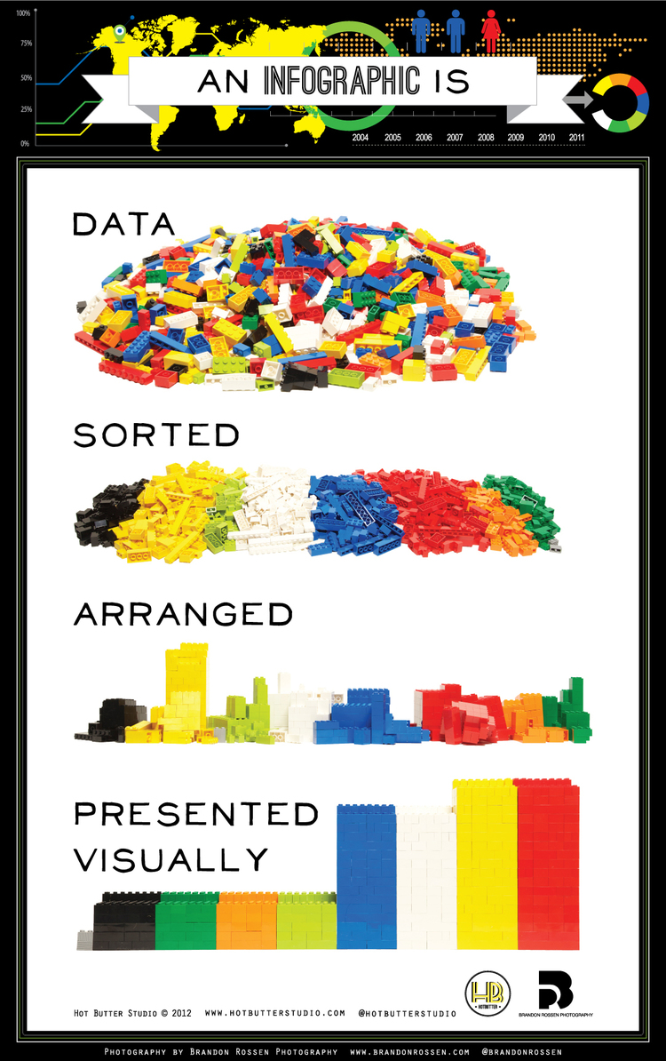
To start off infographics are a visual representation of data or information that is sorted, arranged, and presented visually. They are graphic novels for data. Having visual cues are a faster and easier way for your brain to process data.
They also allow people to come to their own understanding. Visuals get more attention online. It's that sparkly thing on the webpage that draws us in.
Phase 1: Planning
-Choose your audience
-Set goals for your infographic: what do you want to accomplish?
-Choose the right data: if it's not interesting it's not going to make an impact no matter how many colors you use - combine data to make it more complex and interesting
-Always make sure that you are representing the data accurately
-Find the narrative: what's important about this? You want the drama from your data! What's the really important piece you want to get across? Tell the story the data illustrates, not the one you want to be represented
-Choose the right elements: when is the best time to use a pie/bar chart, etc?
Phase 2: Designing
-Establish a format: what will it look like? How do you want the viewer to move through the graphic. Do some wire framing or story boarding for your layout
-Layout: start with your most important piece of information - your "hook". Make sure there is a clear path through your elements and have a good title!
-How to use color: it should enhance the narrative. Use muted shades if you can. We don't want to assault the eyes of our audience.
-Font: use 2 at most and don't make them fancy. We're talking squiggly script here! No flashy elements either - shadows, shading, etc.
-Revise: is it all necessary? Make sure to check your data and get a second opinion
Phase 3: Dissemination
How can they be used in libraries?
-Information Literacy: illustrate ways to do research with process/flow charts
-Marketing Your library and Advocacy: show your stats
-Training: if you're changing a process in your library use them to take patrons or staff through the new steps
-Where?: Infographics are used best on social media, websites, libguides, etc.
-Assessment: Be sure to ask yourself, "Did I meet my goals with this graphic?"
For more infographics about infographics go here.
For the original PowerPoint and other infographic information click here.
And just for kicks:

Most of us solely make authorities who may have genuine expertise using infographics services, in addition to coming from right now there most of us teach all of them in your policies, higher expectations, in addition to system regarding creating a receiving infographic.
ReplyDelete